Most digital planners look fine in a screenshot. On an e-ink tablet the questions are more practical: which page do you actually write on, can you get there with one tap, and was the file drawn for your screen? Those three decide whether you still use it in February.
Start with the page you write on
A planner is not a calendar and it is not a notebook. The page you open every day is the one that decides the layout: a day page if you work from a schedule, a week page if you plan in blocks, a month page if you mostly track deadlines.
The mistake is buying by page count. Four hundred pages of day pages are useless if you only ever look at the week; a beautiful month grid is useless if you need somewhere to put an hourly schedule.
Month, week and day pages compared
| Page | Space it gives you | Best for | It fails when |
|---|---|---|---|
| Month | One page per month, day cells | Deadlines, trips, the shape of the month | You need to write tasks, not just dates |
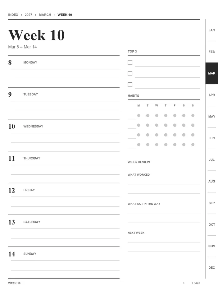
| Week | One page per week | Priorities, appointments, a weekly review | One day needs more than a few lines |
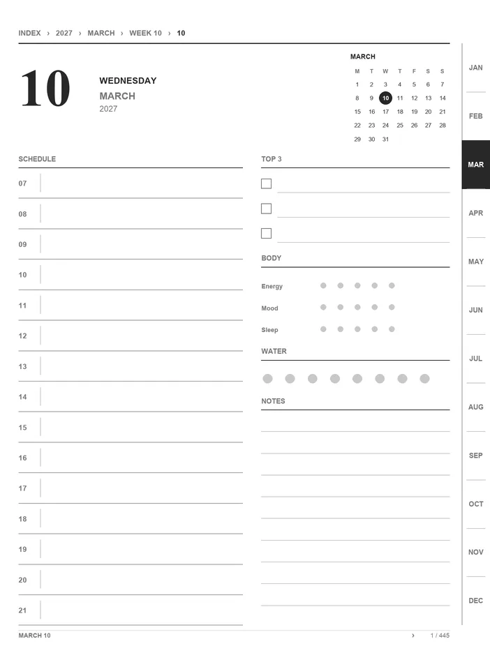
| Day | One page per day | Hourly schedule, to-dos, notes, journaling | You only plan weekly and hate flipping pages |
The useful combination is usually two of the three: a month page for the horizon, then either weeks or days for the actual work. Everything else is a tracker or a notes page, and those are easier to add than to use.
In practice: if your day is a sequence of appointments, a day page earns its space. If you spend the week moving three projects forward, a week page with three priorities does more than seven half-empty day pages. If you only need to know when the rent and the dentist are due, the month grid is the whole job.
Quick pick
- Meetings and appointments: day pages, with a week page for the shape of the week.
- Projects and priorities: week pages, with a month page for the horizon.
- Deadlines only: the free calendar is enough. Do not buy a planner for a job a calendar does.
Links matter more than decoration on e-ink
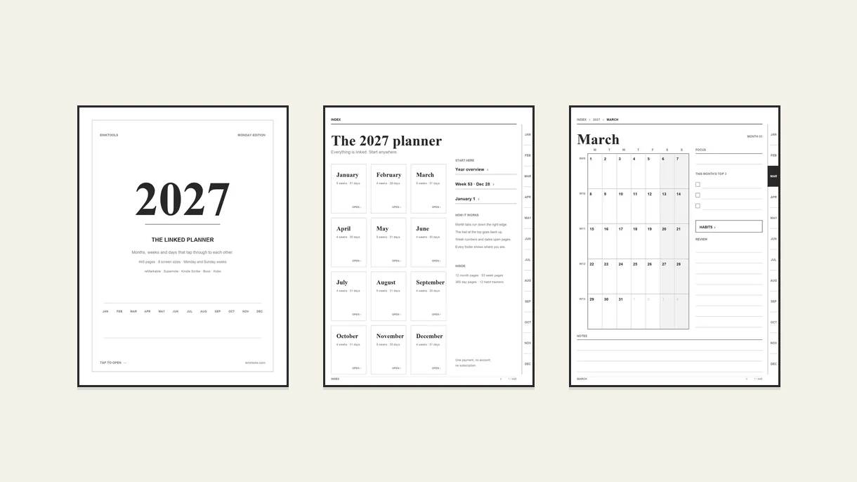
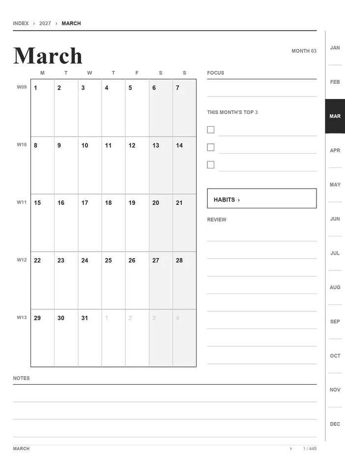
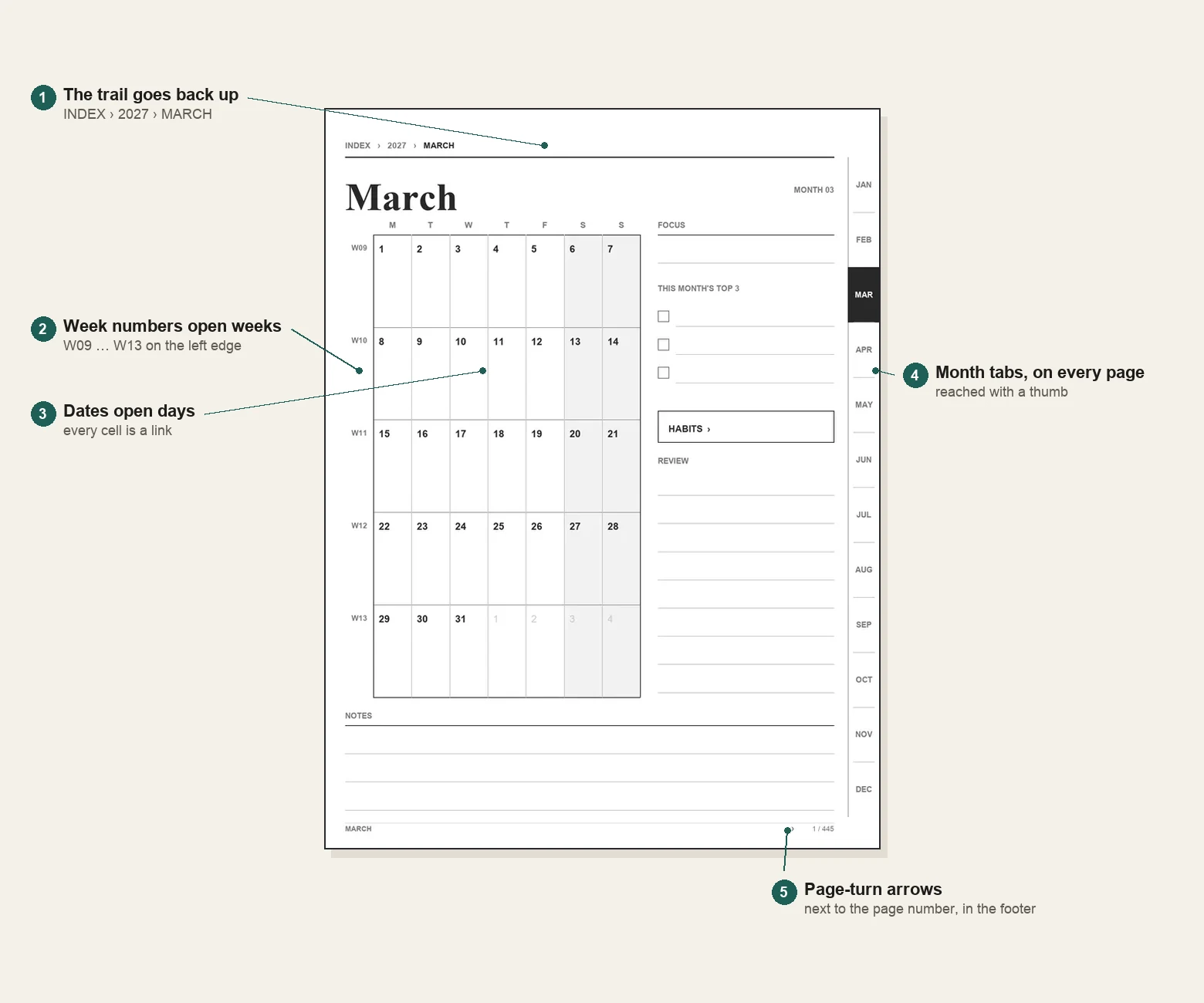
On a tablet, a planner without links is a 400-page book you scroll through. With links it behaves like an app: tap a month tab to jump to March, tap the trail at the top to go back to the year, tap a date on the month grid to open that day.
When you try any planner, check four things:
- Month tabs on the edge. They should be reachable with a thumb, on every page, not just the year.
- A trail at the top. Something like 2027 › March › Week 10, where each step is a link back up.
- Dates and week numbers. A date on the month page should open that day; a week number should open that week.
- Page numbers and page-turn arrows. On a 445-page file, a next-page link is the difference between a book and a planner.
Device behaviour differs. reMarkable, Supernote, Boox, Kindle Scribe and Kobo all open linked PDFs, but some keep the pen tool active, so a tap draws a line instead of following the link. Switch to the finger or select tool and tap again. That is normal, and worth testing on your own device before you buy anything.
A quick test: open the sample, tap March, tap W10, then tap 8, and use the footer arrow to come back. If that takes more than three taps, or a tap draws instead of jumping, the planner will annoy you every week.
Size and week start
E-ink screens differ in shape as well as size: 10.3, 10.7, 11 and 13 inches, at 226 to 300 ppi. A PDF drawn for one panel and stretched to another gives uneven line weights, fat text and clipped edges. A planner should be drawn at each panel's pixel density, so a 7 mm line is 7 mm on your screen.
Week start matters too. Monday weeks usually mean ISO week numbers; Sunday weeks usually mean the US count, where week 1 is the week that contains January 1. Pick the one that matches the calendar you already use, or the week numbers will disagree all year.
A free calendar or a full planner?
If you only need the horizon, the free 2027 calendar is enough: a year page and twelve linked month pages, sized for the same devices. No sign-up, no paid tier.
A full planner earns its price when you want the weeks and days underneath that calendar: a page per week, a page per day, habit trackers and a way to move between them without scrolling. If you never write on a day page, you do not need one.
Try eight pages first
Every planner should let you try the pages before you pay. The sample below is the cover, the index, January, its first week, three day pages and the habit page: eight pages in your screen size, with the links that stay inside the sample working normally.
Open the 8-page sample (PDF) , Download all 8 screen sizes (ZIP)
No email, no sign-up. Keep it, share it, use it.
What to check before paying
- Your screen size. Not just the diagonal: the file should exist for your model's resolution and ppi.
- Your week start. Monday or Sunday, with week numbers that match.
- Links on your device. Try the sample, not the screenshots.
- Delivery and refunds. When the file arrives, what happens if it doesn't work, and whether the licence covers your devices.
- Page count, honestly. A planner with 445 pages should say which 445; 52 weeks and 365 days add up quickly.
Common questions
How many pages does a year need? A year page, 12 months, 12 habit pages, 53 weeks and 365 days come to 443 pages; add a cover and an index and it is 445. Anything much smaller is missing pages, and anything much larger is usually duplicates.
Does it work on my device? If your tablet opens PDFs and follows links, yes. The usual sizes cover reMarkable 2, Paper Pro and Paper Pro Move; Supernote Manta, Nomad, A5 X and A6 X; Kindle Scribe 10.2 and 11 inch and Colorsoft; Boox Note Air and Go 10.3; and Kobo Elipsa 2E.
Can I print it? It is a vector PDF, so it prints cleanly at A4 or Letter, but the layouts are drawn for the tablet's aspect ratio. Personal use only.
Is it a subscription? No. One payment, no account, no renewal. The 2027 planner comes in three editions, and the comparison on that page is the whole feature list.